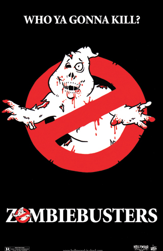
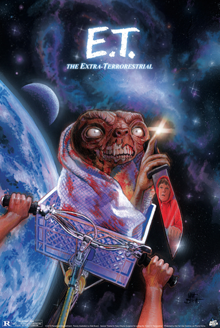
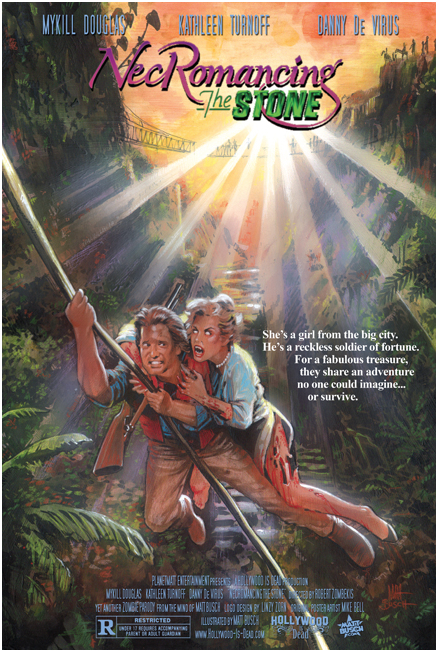
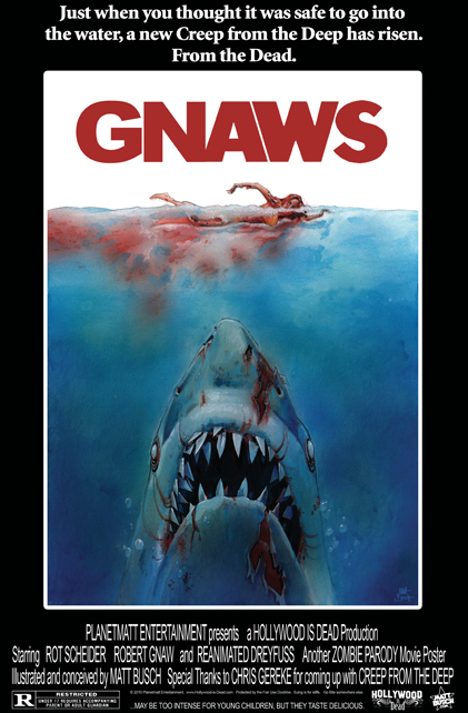
If you’ve been following my recent work here on Halloween Love you will have become acutely aware of my intense love for painted movie posters.
They are the masterpieces that fired my imagination and excited me like nothing else when I was young.
There was no internet to spend day after day on, following the production of movies I was interested in. Anticipation came from two sources; trailers at the start of my Dad’s VHS rentals, and those magical posters that would suddenly appear on bus stops and in the lobby of my local cinema.
Some people can study paintings by the greats for hours … Picasso, da Vinci, Monet, van Gogh, Caravaggio … I feel the same about Drew Struzan, Richard Amsel, John Alvin, Bob Peak, Tom Jung, Matthew Joseph Peak, Graham Humphreys and so many more.
This passion combined with my love of horror meant that creating todays article has been heaven for me, made even more special by having the opportunity to communicate with a man who is keeping the spirit and art of painted movie images alive and kicking, Matt Busch.
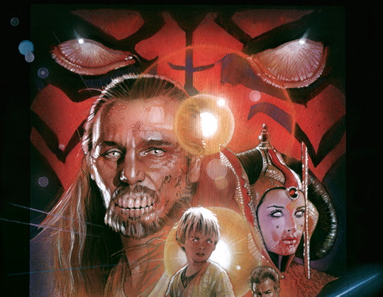
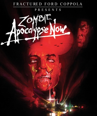
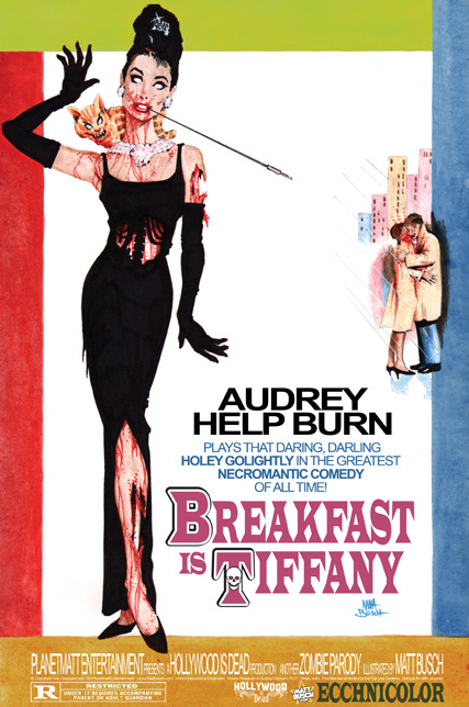
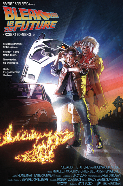
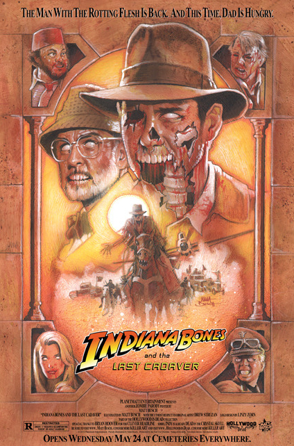
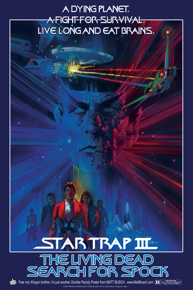
I discovered his ‘Hollywood is Dead‘ project a couple of years ago and have drooled over what he has been doing ever since. These aren’t the original posters with some clever photoshop Zombie effects placed over the top … Matt paints and recreates each classic poster by hand, in the style of the original artist and adds the stunning undead touches along the way. The end results are beautiful, enviable and just about the coolest creations I have ever seen!
Before I reveal my favourites, here is a little Q&A I had with Matt featuring some questions I was DYING to ask …
1. Where did the idea for ‘Hollywood is Dead’ first come from?
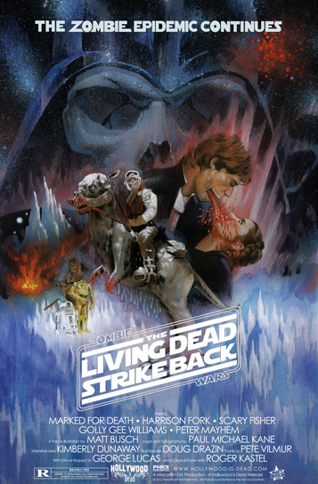
“The idea somewhat came from Lucasfilm. I was requested to do some art that infused Zombies and Star Wars. I thought it would be cool to zombify one of the movie posters. I couldn’t decide which one was best, so I did all six. Those went viral and so there was a demand to do more zombified movie posters beyond Star Wars. I’m a huge movie poster buff, so the idea was intriguing not only as an artist, but as a fan. Thus, Hollywood-is-Dead was born.”
2. You hand-paint and recreate each classic poster. Were any particularly challenging to complete?
“With so many artists having given us so many posters, each style and technique presented challenges, but in general, the more detailed the poster is, the more challenging it is to duplicate it. Which is funny, because most illustrated movie posters are super detailed! But as an artist that likes to learn and likes to grow, I was totally up for the challenge, and enjoyed every bit of it.”
3. Do you have a personal favourite movie poster artist?
“I think Drew Struzan has always been king. He’s the first artist I really started looking at, even as a young teen. But there are many other poster artists I admire, and certainly doing all of these tributes, studying all of the masters gave me a bigger appreciation for all of them, even more than what I had before.”
4. Was art your destiny from a young age or did someone or something put you on the creative path?
“I don’t know if visual art was my destiny, but creativity certainly was. I was always drawing, writing, playing music instruments, building things, and making home movies. There were so many things I wanted to be when I grew up, but professionally, art seemed to be the easiest door to open at first. I love that all of the arts kind of tie into each other. I also love that there is always more to learn and places to evolve to. I’m happy that many see me as a pro, but I see myself as a student for life. Haha!”
5. Do you have a favourite horror movie, or at least a favourite ‘type’ of horror movie?
“Not sure what my all time fave is… Maybe the original Evil Dead. I also have a fondness for Poltergeist. My favorite horror movies are the ones that have more of a supernatural flare than the ones that are just slasher and/or gore. So anything with a haunted house is a must-see for me. I tend to like most of the Asian horror movies as well.”
6. Finally, is there one zombified poster that you were most pleased with after finishing it, or is that the classic ‘favourite child’ question?
“I can answer that 3 ways.”
“The one that I think turned out best is Zombie Wars: The Living Dead Strike Back. The original is such a classic poster and I think what I brought to the table was pretty gnarly.”
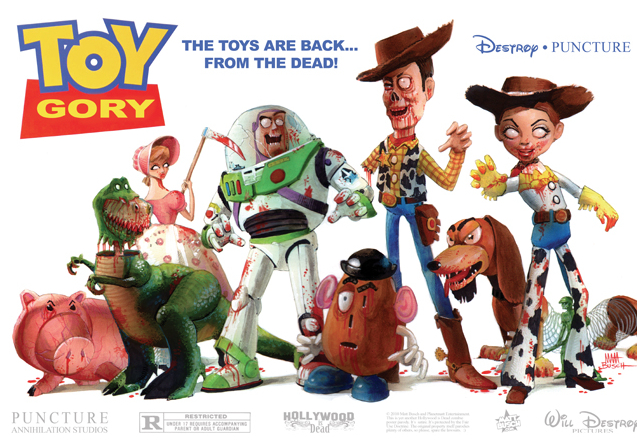
“My favorite one to work on was probably Toy Gory. I remember that I couldn’t stop laughing as I was doing it.”
“And the fan favorite that people seem to appreciate most is Breakfast is Tiffany. There’s a version available on www.Hollywood-is-Dead.com that is 24″ x 36″, which is movie poster size. I keep waiting for someone to make a YouTube video where they go into someone’s house and take their framed “Breakfast at Tiffany’s” poster and replace it with Breakfast is Tiffany. I want to see how long it takes for them to notice and the WTF expression on their face once they do!”
Oh behalf of myself and everyone here at Halloween Love I want to say a huge thank you to Matt for taking some time to respond to my questions. I will leave you with my favourite Hollywood Is Dead posters … I love them ALL but after several hours of deliberation (seriously!) I have selected seven to feature here.
Support Halloween Love
If an item was discussed in this article that you intend on buying or renting, you can help support Halloween Love and its writers by purchasing through our links:
(Not seeing any relevant products? Start your search on Amazon through us.)
