Welcome back fiends, I hope you all had a happy horror-filled weekend and feel refreshed and prepared for the week ahead.
My ongoing quest to learn everything I can about the alternative movie art community and the main players within it has reached an exciting destination today (for me personally), as I have finally got around to having a chat with uber-talented Ape Meets Girl, aka Kevin M Wilson.
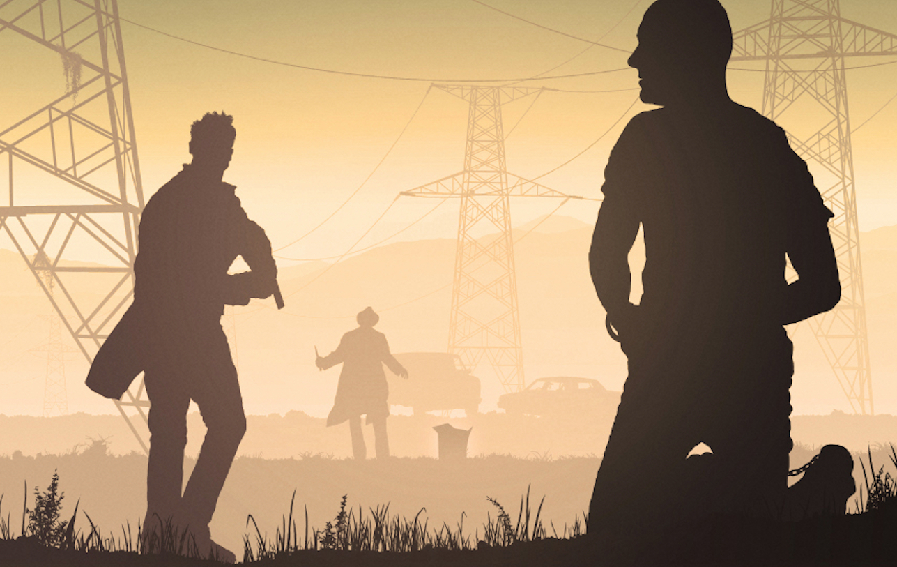
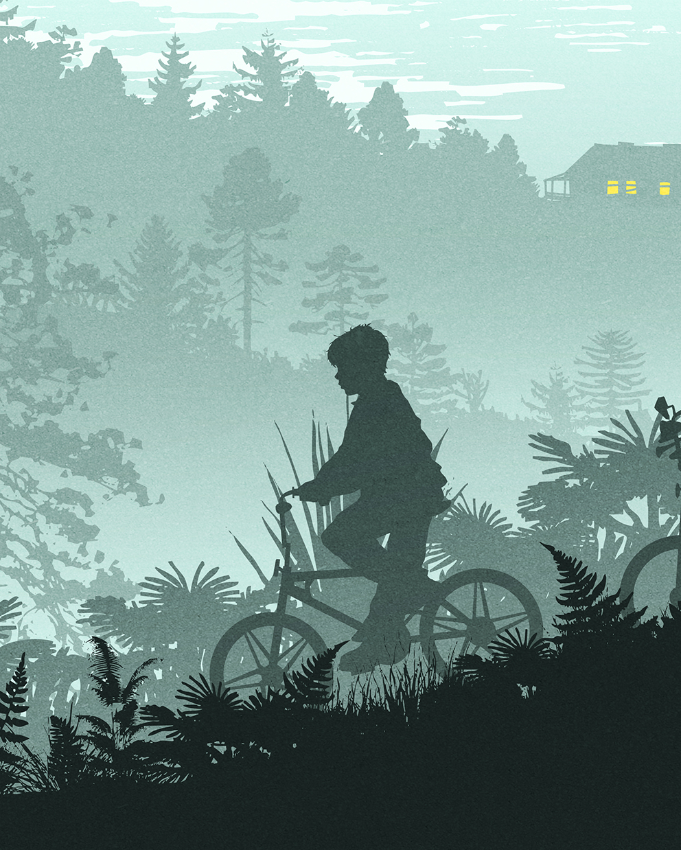
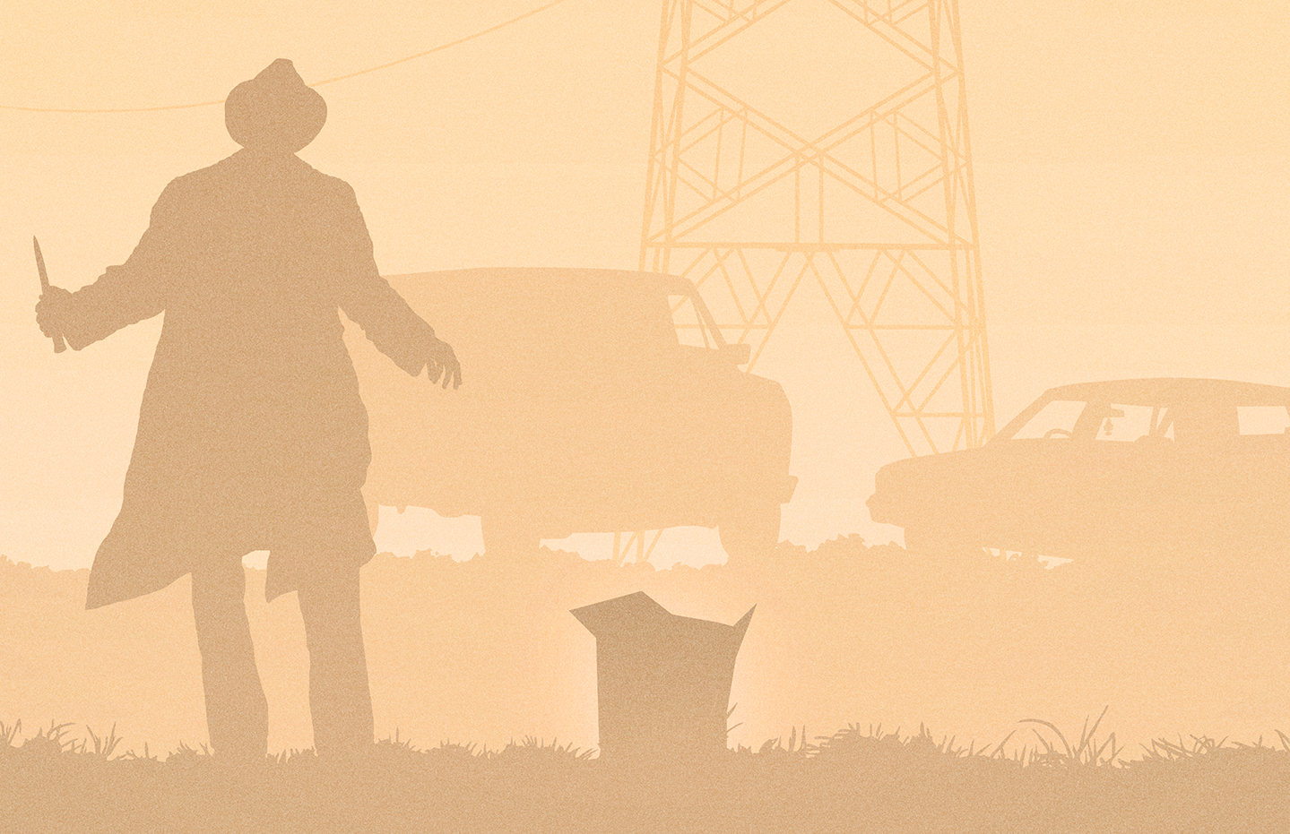
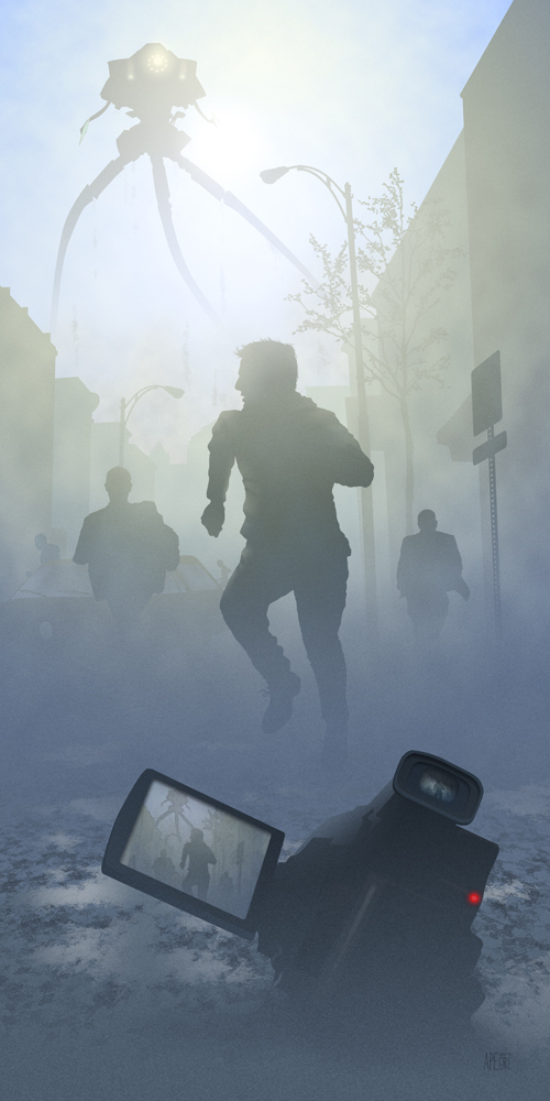
I’m excited because Kevin creates my favorite kind of art – art with atmosphere. Images that send shivers down your spine and remind you just how magical movies can be. He also primarily uses silhouettes within his pieces and anyone who reads my art interviews regularly will probably be aware just how much I adore silhouettes when they are executed with skill.
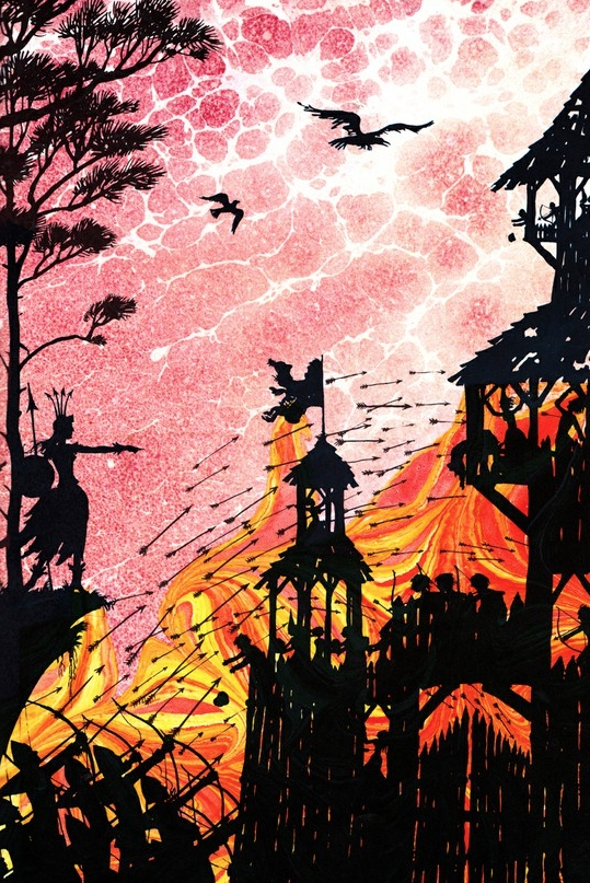
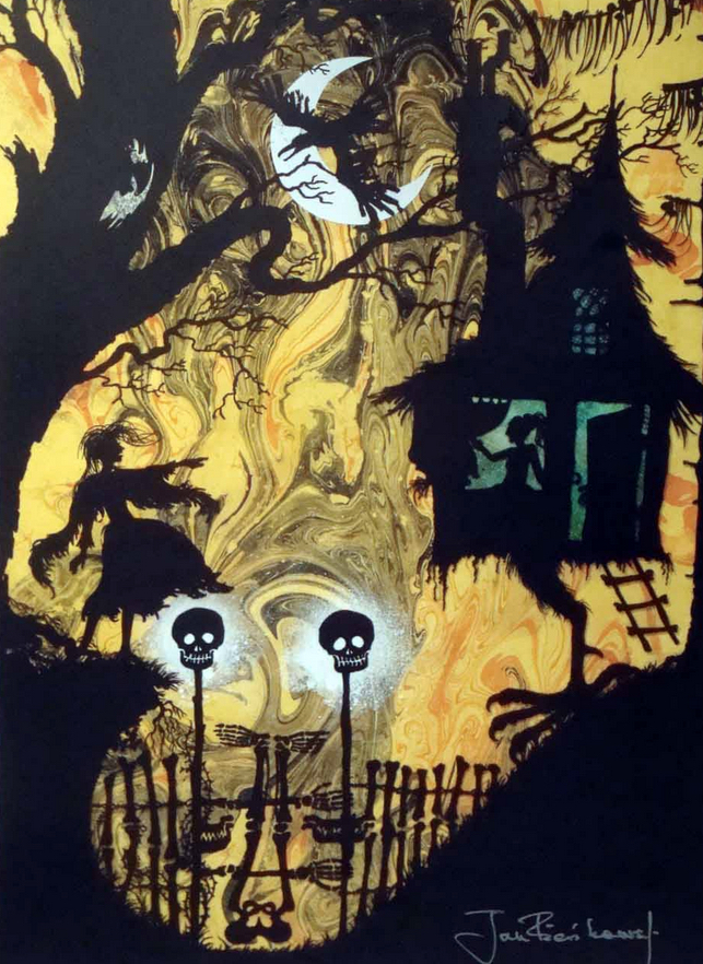
My love for them as an art form goes way back to my early childhood when I would spend hours just flicking through books illustrated by legendary artist Jan Pienkowski. See below for a couple of examples … I just found his work SO fascinating, gothic and atmospheric!
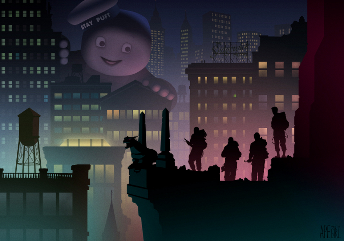
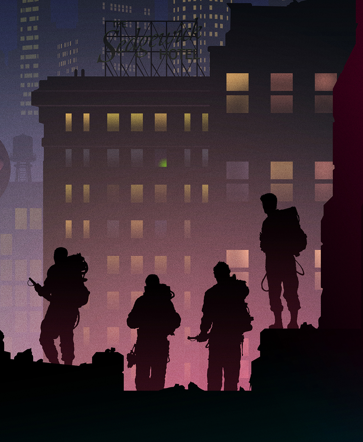
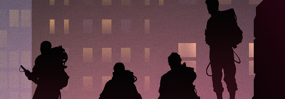
Kevin is also the man responsible for what I consider to be the greatest piece of Ghostbusters art I have ever had the pleasure of obsessing over, it’s just magnificent!
I was seriously thrilled to hear back from Kevin very quickly after making contact with him, and he downed tools long enough to provide me, and all of you, with a wonderful little insight into his life and art. A brilliant chat with a brilliant artist, take a look …
Halloween Love: First of all, can you tell me a little bit about your artistic journey. Do you think it was a destiny from a young age?
Kevin Wilson: “Film and TV has always been a huge passion of mine, as has illustration, but I guess I never imagined myself bringing the two of them together. I struggled for a long, long time to realize where I wanted the journey to take me. As a kid I grew up with Goonies and Ewoks. After school my brothers and I would play He-Man. At weekends I would buy Garbage Pail Kids or Wrestling stickers, and we’d watch Knight Rider, The A Team and Land of the Giants. All this stuff was hugely important to me, I just never knew it at the time. But most important of all was the work of Drew Struzan. That guy illustrated my childhood. I would study every detail of every piece (which was probably just a VHS cover). I never knew his name at that time, but I could spot his work a mile off.”
“Then you reach your teens and there are a whole load of new influences. These start to change you, but the change is temporary. I studied Illustration at University and I really found it challenging. I could never really understand what was expected of me. Then in my final year I kind of gave up on trying and did what I wanted to, a set of four screen printed movie posters, somewhat inspired by Saul Bass. Right then I realised that was what was expected of me, to show who I am. It was just a little late in the game.”
“I left University and began a career in finance. I was still drawing, I’ve never stopped, but it was a hobby, nothing more. Many times I had tried to make something more of my work, constantly asking myself ‘what are people looking for?’, but I didn’t know the answer, and whenever I thought I had the answer, it was of no interest to me. Then I started to discover the work of guys like Eric Tan, Laurent Durieux, Scott C. Campbell and Andrew Kolb. It dawned on me immediately that none of these guys were doing what was expected of them, they were doing whatever they wanted. From there on in I started drawing again, and all those childhood memories came flooding back. All that stuff was hugely important, but now I knew it. I realized I was still a Goonie and and I went with it.”
HL: The use of accurate and intricate silhouettes is an art style that has appealed to me from a young age, is it a difficult technique to master?
KW: “I can’t really tell you until I master it myself. But it’s certainly challenging yes. I have seen people talk about the use of silhouettes as a cop out, a tool to hide an artist’s shortcomings. The way I look at it, an artist can use a thousand lines to portray someone, and they are going to achieve a pretty good likeness. I use one line. And with that one line I need to try and convey not only a likeness, but an expression and a mood. That is something I will labour over for hours.”
“Sean Astin recently saw my Goonies piece along with his family, and apparently his wife commented on how much the image of Sean looked like their young daughter. That tells me I nailed it, and you can’t beat that feeling.”
HL: Can you give me a rough idea of your process when starting a new piece from concept through to completion and the average length of time it takes to finish a new image?
KW: “I always start on paper. Maybe it’ll be my sketchpad, maybe a Post-it, but either way it starts on paper. At this stage I’m just thinking about the composition, not color or detail, but just how I will make the shapes work within the image. From there I start on the digital image, where I will rough in 4 or 5 layers to get a sense of the depth I will need.”
“Once the composition is nailed I then start on the details. Sometimes front to back, sometimes back to front. I have a tendency to spend far longer than necessary on the detail. There have been times I have spent a whole evening on a silhouette, drawing every individual hair on a head, and then I put it back into the composition and I scale it to fit, and all that detail is gone. But I know it’s there, and that’s all that matters.”
“For example, when I did my Se7en piece, which was the first piece I did for Hero Complex Gallery, I originally envisioned a piece based on Sloth, with the light coming through those filthy windows, bouncing off all those tree shaped air fresheners. The image wasn’t working and I abandoned it, switching to the Wrath piece I eventually went with. When I did that, I had to get a nod to the Sloth scene in there, so I put a little air freshener in Somerset’s car. You can hardly see it in the final print, but again, I know it’s there.”
“When the solid shapes are all in I start to play with the light and textures, and this is when things start to come to life. I’ll also play with color at this stage. I may have a rough idea of the palette at the start, but this inevitably changes at this point as I play with light and how the shapes affect the glow and atmosphere.”
HL: To me, you seem to have the ability to take the natural color scheme from any movie moment and then ‘enhance it’ – enrich it, to compliment the silhouettes contained within. Is this an accurate observation?
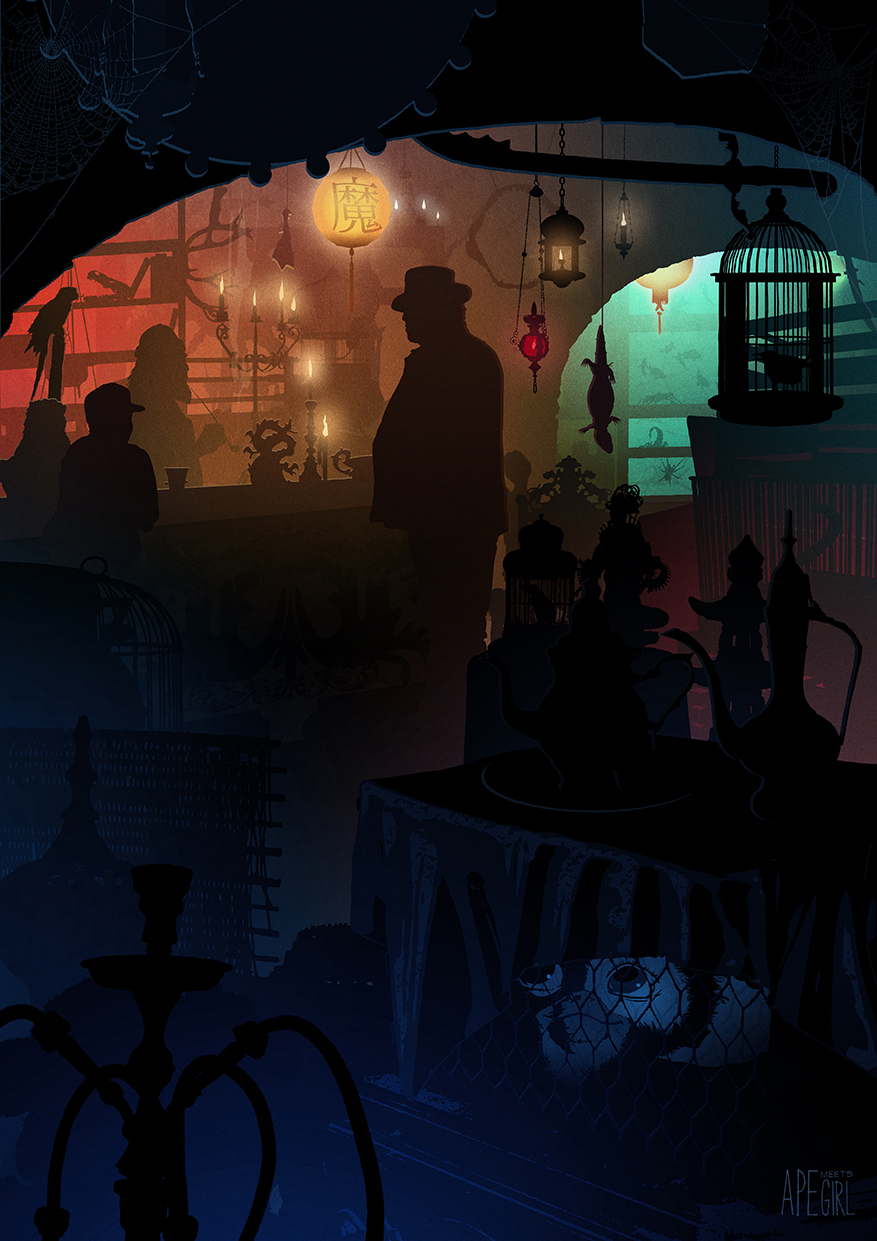
KW: “It’s interesting you see it that way, and until you asked the question I’ve never really considered it. When I’m working on a piece I will always refer back to the original source, to check the details, maybe an important sign, or a particular layout of a room. But generally, most of it comes from nostalgia, and my recollection of the scene. That allows me to move around that scene and consider it from another angle. At the same time the colors will come mostly from memory. With my Gremlins piece I didn’t look at the colours in the film at all. I just had this vivid memory of low moody lighting coming from several unknown, tucked away sources. With my Diagon Alley piece, the colour scheme, and the whole inspiration for the piece, came from a photo I saw of a street in Tokyo.”
HL: Always a nasty question, but do you have a favorite poster? Perhaps something that exceeded your expectations when completed?
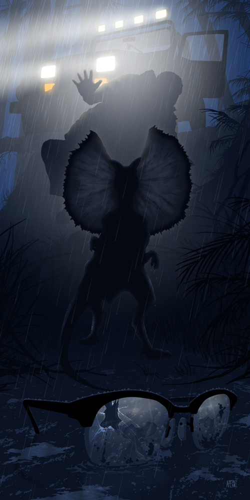
KW: “Yes, a very nasty question. Always hard to talk up any of my own work. But I’d probably have to say the Jurassic Park piece that I did for Hero Complex Gallery. I was keen to showcase the Dilophosaurus. That guy was awesome and it was time someone showed him some love. I originally planned to have the shaving foam can in the mud in the foreground, and when I started working on that the rest of the image was pretty much done. But the can just didn’t work, and I never did pinpoint the issue. I went back to the film, which I had avoided until then, and it reminded me of Nedry losing his glasses. I had great fun working on that piece, which was probably more detailed than anything else I’ve done, down to the individual drops of water on the frames and the reflections of the whole scene in the lenses.”
HL: My personal favorite is your Ghostbusters piece that just oozes atmosphere on a level I’ve rarely seen. Was that an enjoyable image to create and am I correct in thinking that the subtle green glow within the hotel window is our little friend Slimer?
KW: “Ha, I’m glad you spotted Slimer. Most people don’t. That piece didn’t start out fun. It was originally a whole different scene, based on Slimer in the ballroom. I had the image about 90% done, but it just wasn’t working. Something was wrong, and again I never figured out what. Then I stumbled across Mark Englert’s piece. It was practically the same composition I had been working on, so I abandoned it, and started working on Stay Puft instead. As soon as I knew that piece would be from the rooftops, I knew I would have to get a Sedgewick Hotel sign in there. I figured a true fan would pick up on the nod, and for anyone else it was just set dressing.”
“Slimer himself was a last minute addition. I couldn’t help myself!”
HL: Finally, are there any movies that you are desperate to illustrate but haven’t had the chance yet? And what does the immediate future hold for you regarding your art?
KW: “The one film I kept returning to over and over again was Jaws. I threw out so many ideas for that. It’s been done a lot, and it’s been done well, as you guys showed recently. I figured if I couldn’t think of something fresh and original, then I shouldn’t do it.”
“Then I was recently approached about doing a commission for Jaws, and my heart sunk. But together the commissioner and I came up with an idea which we both agreed was new, and looked at the film from an original perspective. That piece is finished now and it has far surpassed any of those original concepts that I ditched. I’m sure you’ll see it very soon and I hope you enjoy it as much as I did creating it!”
I want to say a HUGE thank you to Kevin for freeing up some time to be involved. It was a pleasure to get to know him a little better and putting this interview together was a lot of fun. To keep up to date with all his latest work and news just head over to his facebook page and give it a LIKE!
Support Halloween Love
If an item was discussed in this article that you intend on buying or renting, you can help support Halloween Love and its writers by purchasing through our links:
(Not seeing any relevant products? Start your search on Amazon through us.)
