
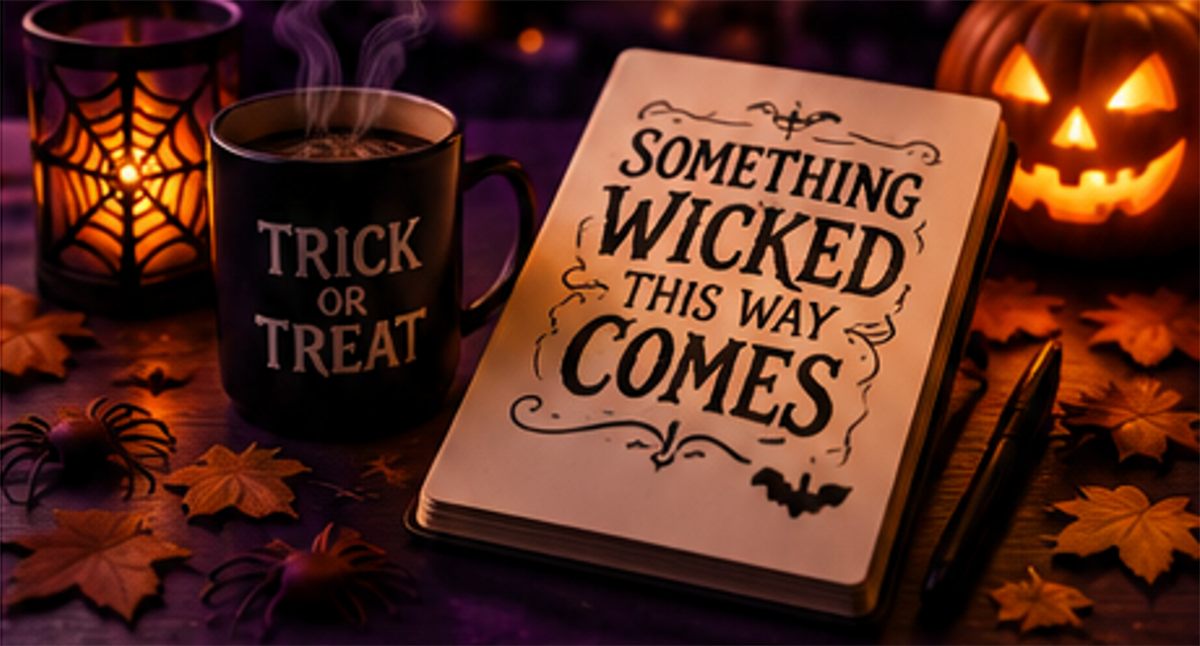
Halloween design has two jobs: it must create a mood and still tell people what to do next. A poster can feel haunted, a party invite can feel playful, and a horror blog can feel grimy or nostalgic. But if readers cannot find the date, title, price, warning, link, or credit, the design loses power.
Halloween Love is a natural context for this topic because it lives in the space between Halloween, horror, movies, strange pop culture, and fan enthusiasm. That makes type choice more than decoration. It becomes part of how a spooky idea is framed, remembered, and shared.
Reading Order Before Blood Splatter
The first test is simple: can the reader understand the message before noticing the texture? Distressed letters, sharp serifs, dripping shapes, and occult symbols can help build atmosphere, but the reading order still has to be clear.
| Halloween Asset | What the Reader Needs | Type Risk to Avoid |
|---|---|---|
| Horror movie post | Title, release context, opinion angle | All-caps display type used for long paragraphs |
| Haunted house poster | Date, location, ticket detail | Decorative font hiding practical information |
| Pumpkin trail page | Family-friendly mood and directions | Low contrast over night photography |
| Merch listing | Size, price, licensing, material | Unclear numerals or cramped labels |
What Must Stay Readable
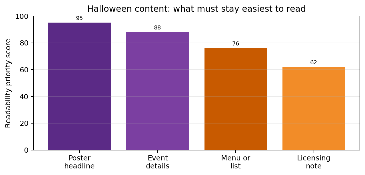
A Halloween campaign can be theatrical, but the most functional words should remain plain. Treat dates, prices, addresses, age ratings, captions, and legal notes as survival text because people need them to act.
The best Halloween type does not only look scary. It lets the reader feel the scare and still know exactly where to click, go, buy, or read next.
The Costume Rack: Match Mood to Role
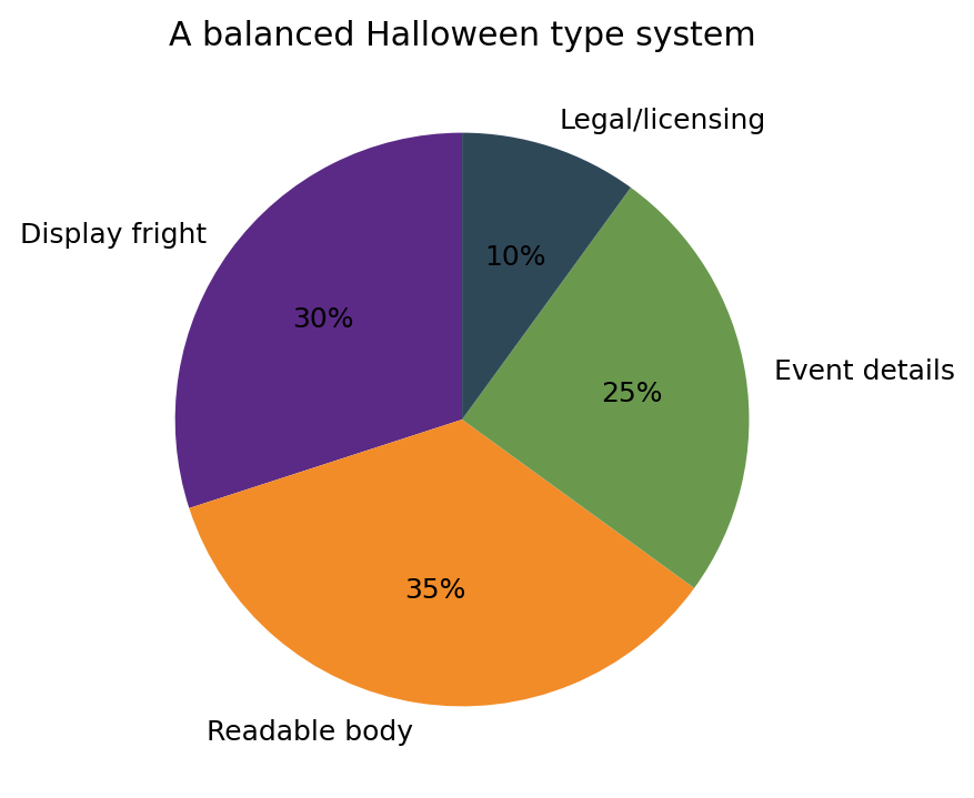
The mistake is choosing one scary font and forcing it into every job. A stronger approach is to build a small type cast, almost like characters in a horror film. Each role should do something different.
- Use a display font for the hook: posters, hero titles, stickers, and short social graphics.
- Use a readable body font for reviews, essays, captions, instructions, and licensing notes.
- Use a clear numeric style for dates, ticket prices, rankings, ratings, and product sizes.
- Use decorative symbols carefully: bats, bones, pumpkins, or scratches should support the text, not replace it.
Outside the Crypt: Real Brand Lessons
A Halloween site does not need to imitate corporate branding, but custom font cases show how visual voice scales. Domino’s Pizza customized TT Commons Pro into Dominos Sans Display and Dominos Sans Text, proving that a food brand can keep menus, apps, packaging, and ads aligned. Rocket uses WNTL and Bowtie to balance accessibility with trust. PetChoy customized TT Trailers, a useful lesson for playful seasonal products and pet-themed Halloween campaigns.
For teams comparing professional font families, commercial licenses, or custom type options, foundries such as TypeType can be reviewed during the design system stage, not as a last-minute decorative search.
Mistakes That Break the Spell
Halloween typography fails when the mood becomes stronger than the message. The most common problems are small, but they change how a design feels and whether it can be trusted.
- Using a dripping or distressed font for paragraphs instead of short headlines.
- Mixing five or more typefaces because every graphic needs a new spooky effect.
- Putting pale text on dark photos without enough contrast.
- Using unclear numerals for dates, prices, rankings, or event times.
- Forgetting that horror shirts, posters, stickers, PDFs, and web pages may need different font licenses.
Licensing: The Practical Spellbook
Fonts are software, so font licensing matters even when a design feels like fan art or a one-night Halloween idea. Personal projects, commercial merch, event posters, paid campaigns, downloadable PDFs, and editable templates can require different permissions.
| Use Case | Check Before Publishing | Safer Choice |
|---|---|---|
| Personal Halloween graphic | Is personal use allowed? | Keep it non-commercial if the license says so |
| Paid event poster | Does the license allow commercial print? | Buy the correct print or desktop license |
| Horror merch or shirts | Can the font appear on products for sale? | Confirm merchandise rights |
| Website or blog theme | Can the font be embedded online? | Use a webfont license |
| Editable template | Can buyers receive editable files? | Avoid bundling font files without rights |
Before publishing a Halloween design, ask three questions: does it feel like the right kind of fear, can people read the important words quickly, and are the font rights clear? If the answer to all three is yes, the design can be theatrical without becoming confusing.
The strongest Halloween typography is not the loudest. It is the type that creates atmosphere, protects the message, and lets the reader enjoy the darkness without getting lost in it.
Support Halloween Love
If an item was discussed in this article that you intend on buying or renting, you can help support Halloween Love and its writers by purchasing through our links:
