In Space, No One Can Hear You Scream! – But maybe you CAN look at some incredible alternative posters before you get ripped apart!
I recently revealed my favorite alternative posters for Jaws and Stephen King’s IT – this week I take a look at some more stunning art that this time pays tribute to Ridley Scott’s masterpiece Alien. It was incredibly hard to narrow this down, even more so than usual, but what you see here are my personal favorites. Grab a flamethrower and let’s enter the darkness …
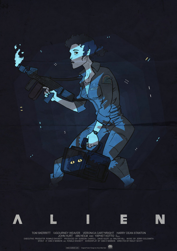
ALIEN POSTER – (Ross Burt)
I love the style Ross has used for this piece, and his extensive work in the video game industry really shines through. It has a cartoon look, but the considered use of darkness and shadows brings it to life. And yes, I’m ashamed to say it was a minute or two before I noticed the shadow over Ripley is being created by our old friend the Alien. The tension at the end of the movie was seriously increased by the dark, claustrophobic lighting Ridley Scott used, and this poster recreates it perfectly. I can almost hear Mother’s voice counting down the time until the emergency destruct system goes BOOM!
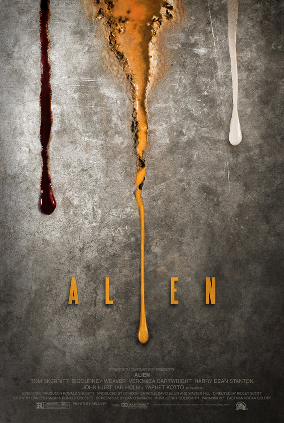
Alien Poster – (Adam Rabalais)
I remember just grinning like an idiot the first time I laid eyes on this piece by Adam, mostly due to how perfectly clean, simple and effective the whole thing is. I think it must appeal to my sense of neatness and subtle OCD. Three lines of blood, trickling down what could be a metallic surface within a spaceship, or a distant colony – each representing the internal fluids we see frequently across the entire Alien saga. Human blood, corrosive Alien blood, and of course the milky android blood. You could just have the image on this poster without ANY text and movie fans would instantly know what it represents. That’s the sign of a very clever design and skilled execution.
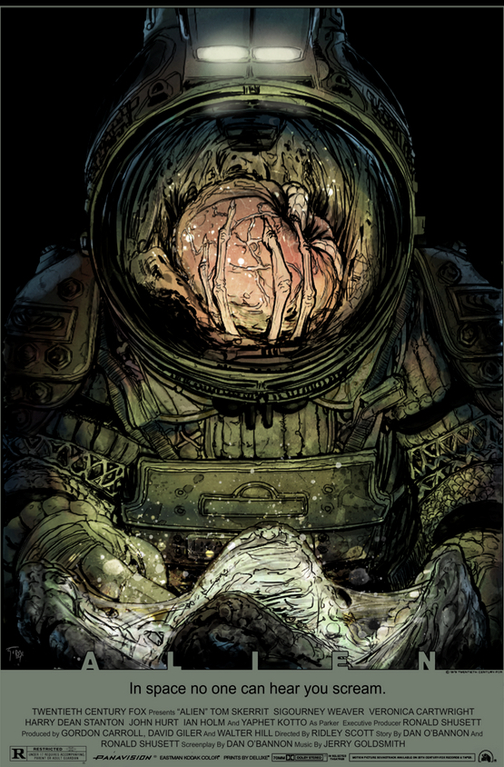
Alien – (Tristan Jones and Luis Antonio Delgado)
When I was young, the moment that unnerved me the most was by FAR the whole egg discovery scene. The way it slowly opens and you can’t really understand what you are looking at – some kind of skin sack that deflates and oozes, then Kane leans forward and … well, you know! This piece is the ultimate tribute to that scene thanks to the awesome reflection that Tristan decided to use on Kane’s helmet. The detail on the spacesuit is perfect and Delgado’s subtle colors bring it all together into a little slice of artistic and atmospheric brilliance.
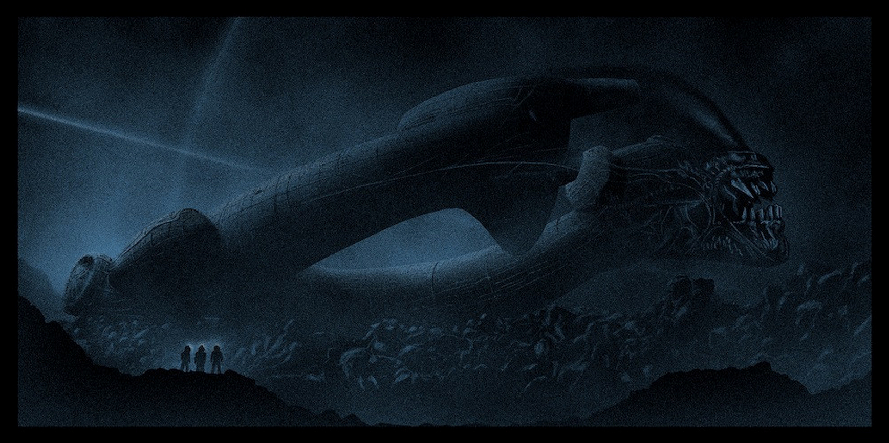
“LV-426” – (Marko Manev)
Once again Marko delivers what he does best – epic and atmospheric art that makes you instantly want to watch the movie again. Blending the Alien head into the derelict Space Jockey ship is a brilliant design choice, while the subtle glow from the helmet lights of the Nostromo crew members draw your eye toward them despite being dominated by the harsh landscape that surrounds them. This is my kind of poster art, silhouettes and dark magic!
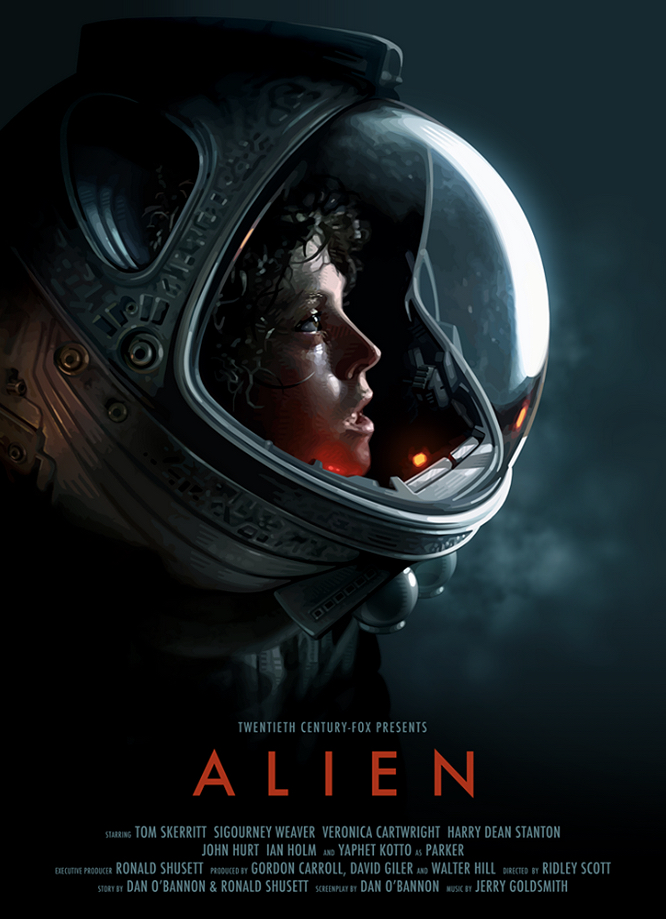
Alien Poster – (Candykiller / Brian Taylor)
Ripley’s terrified expression framed within the helmet has become an iconic image which many artists have chosen to be the focal point of their alternative Alien movie posters. There are some great examples out there but in my humble opinion this piece by Brian is on a different level. From the beautiful lighting to the near photorealistic skill involved – it’s a hypnotic piece of art that you can’t help but study.
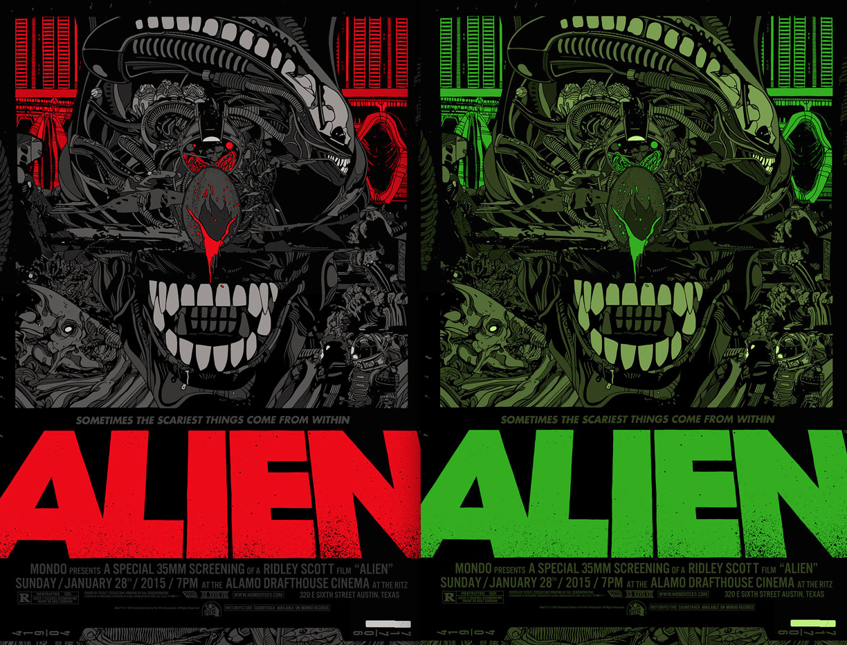
Alien – (Tyler Stout)
I’m going to be unpopular now and admit that I’ve never been a huge fan of the Mondo posters that Tyler creates. Just a personal preference thing, I’ve always liked more subtle art, and I think even Tyler would agree that he’s anything but subtle! That said, I LOVE his recent Alien piece that was revealed earlier this year. It’s been put together in his normal style but something about the complex and busy design really complements Giger’s creature, and the whole concept comes together to create a wonderful and unique poster. I’ve included both versions but much prefer the more limited green variant he created.
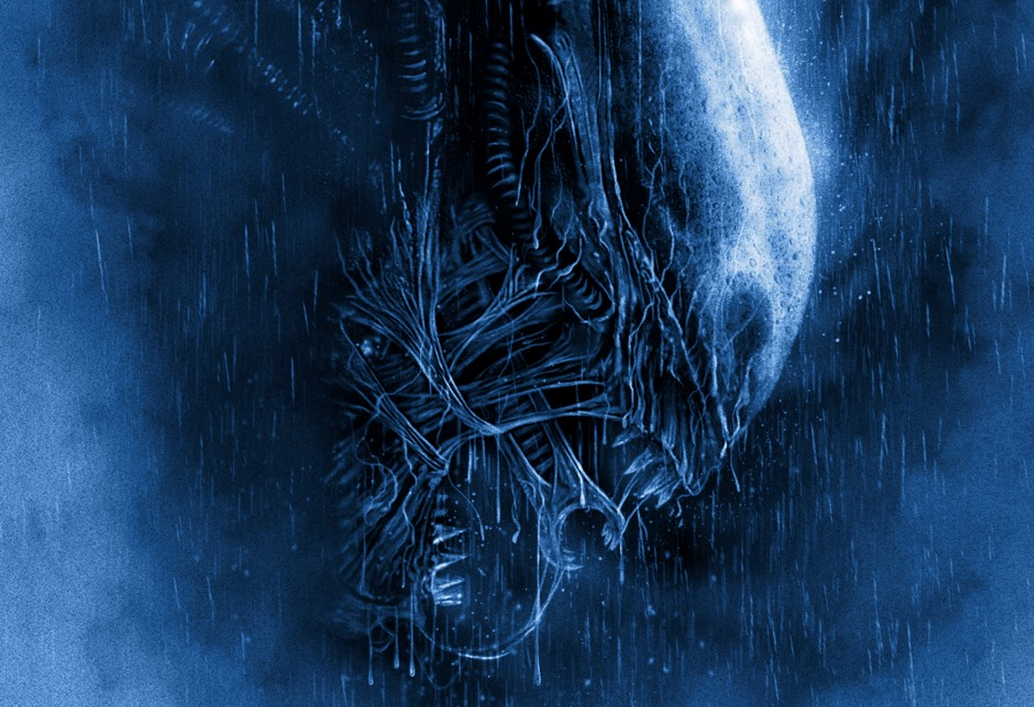
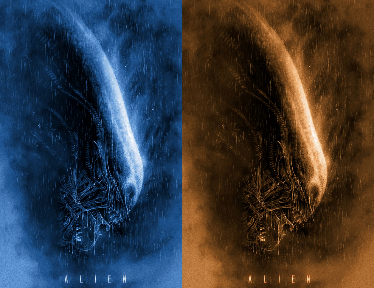
Alien – (Casey Callender)
Atmospheric, intense color and raw unstoppable power – once again Casey proves why he’s one of the best alternative poster artists out there right now. The water enhances and illuminates the shape of the Alien head and the subtle steam effect frames the whole the thing in a very pleasing way. It’s a poster that always reminds me of Brett’s death scene from the original movie, which of course was the first time we got to see what the rapidly growing creature looked like and discovered just how hostile and deadly these things are. I’m not sure if that was the inspiration behind the piece, but what I AM sure of is my love for this art.
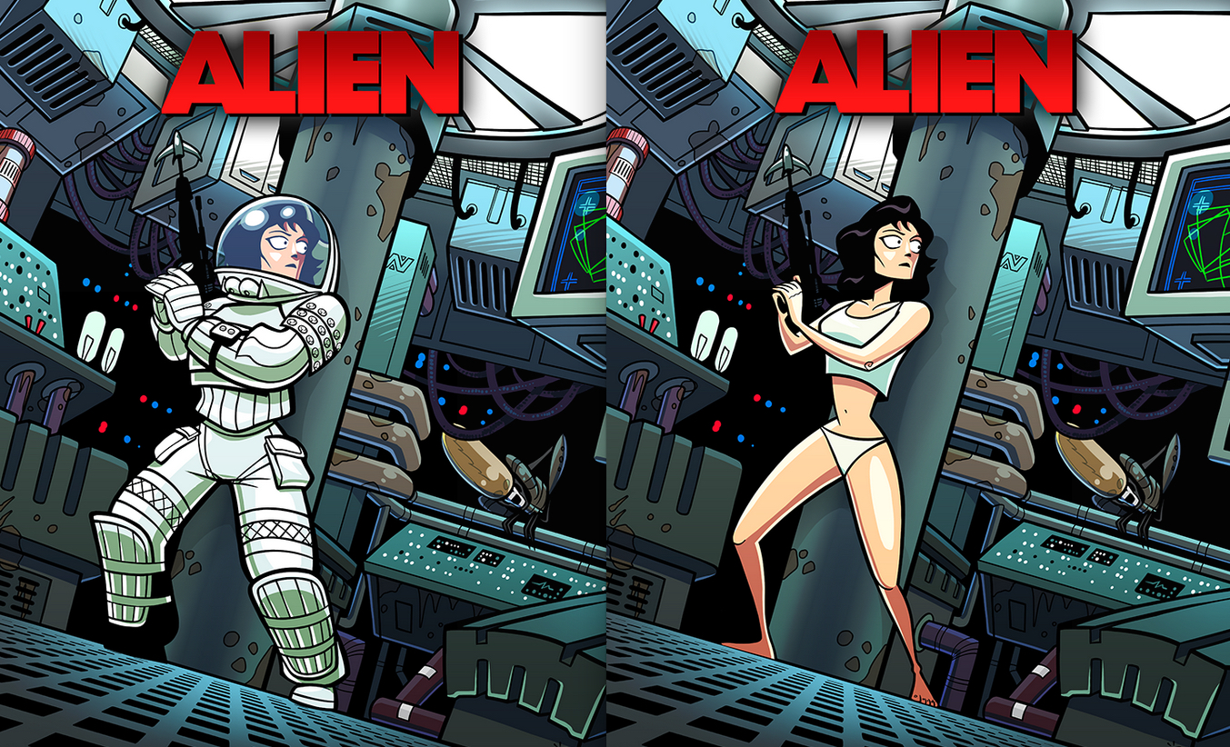
Ripley, Last Survivor – (Ive Bastrash)
We finish with this awesome artwork from Ive, who is one of the biggest fans of the Alien franchise you are ever likely to interact with. It’s a style that makes you imagine what a Saturday morning Alien cartoon show might look like – although the “panties edition” makes me think Ripley would need to be kept in her spacesuit if kids are involved! There is a fine tradition in recent years of talented individuals taking characters and creatures from very adult movies and giving them cartoony makeovers. Ive has created some of the very best and including his Alien work in this list was always on my mind.
Did I miss any posters that you personally love? Feel free to drop a comment below. Next week we move on to the second movie in the franchise – Aliens! And I can tell you now that selecting a few favorites for that is proving just as tough!
Support Halloween Love
If an item was discussed in this article that you intend on buying or renting, you can help support Halloween Love and its writers by purchasing through our links:
(Not seeing any relevant products? Start your search on Amazon through us.)
